Scandi-Inspired Family Home
Brighton & Hove
Bright, minimal and contemporary, with a noticeably Nordic feel
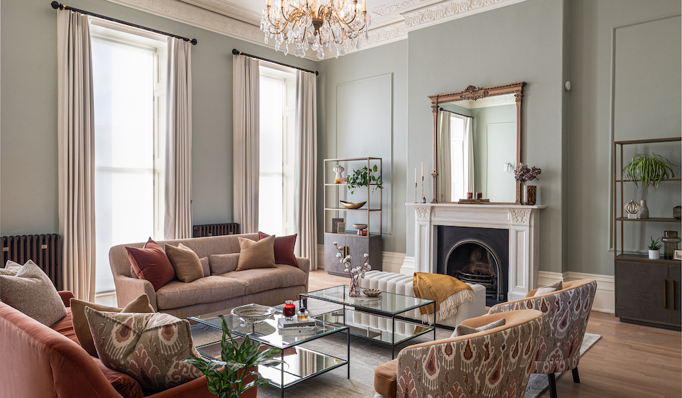
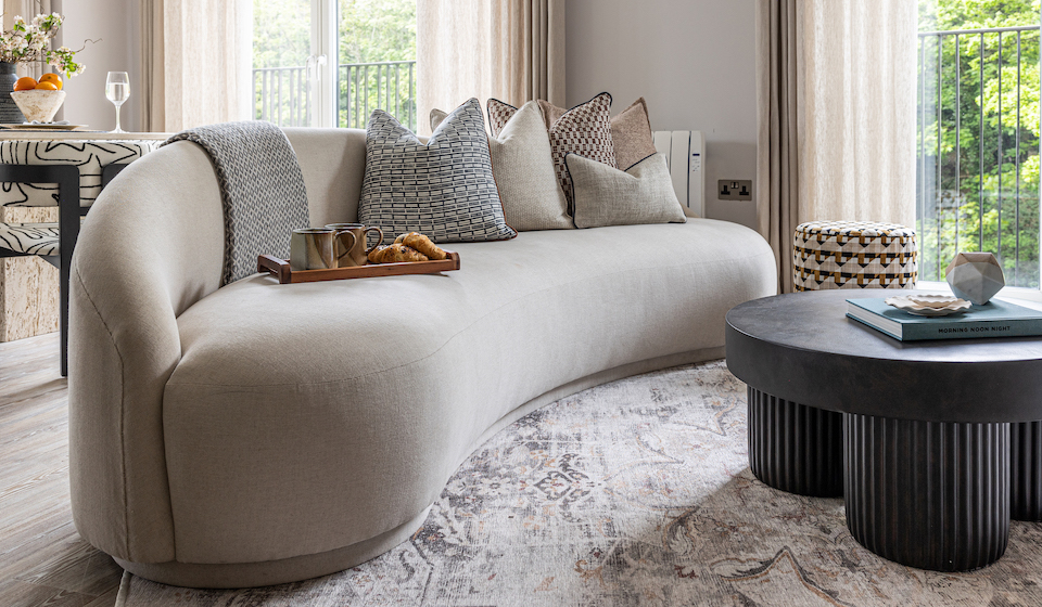
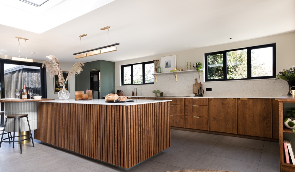
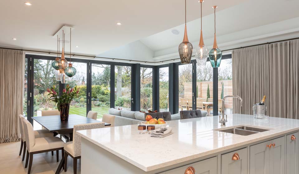
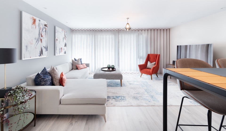
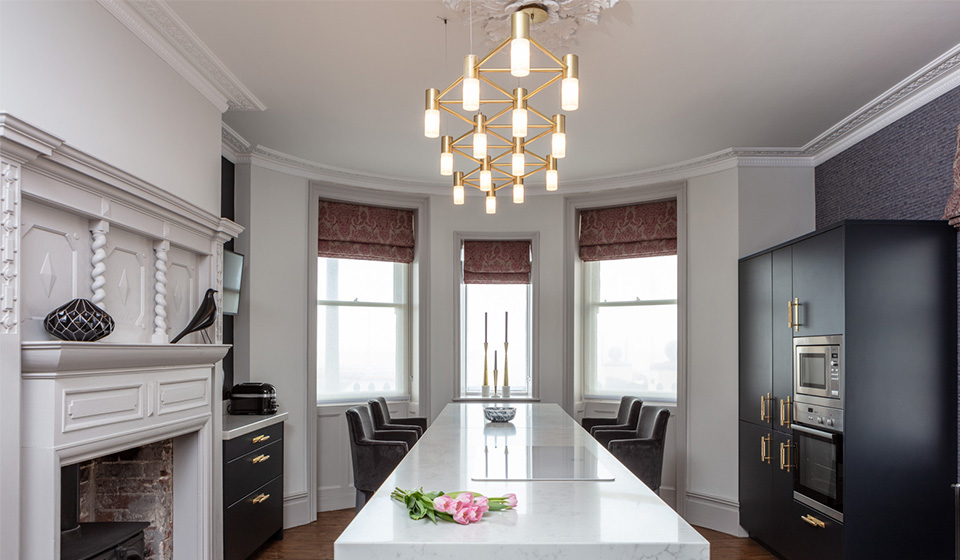
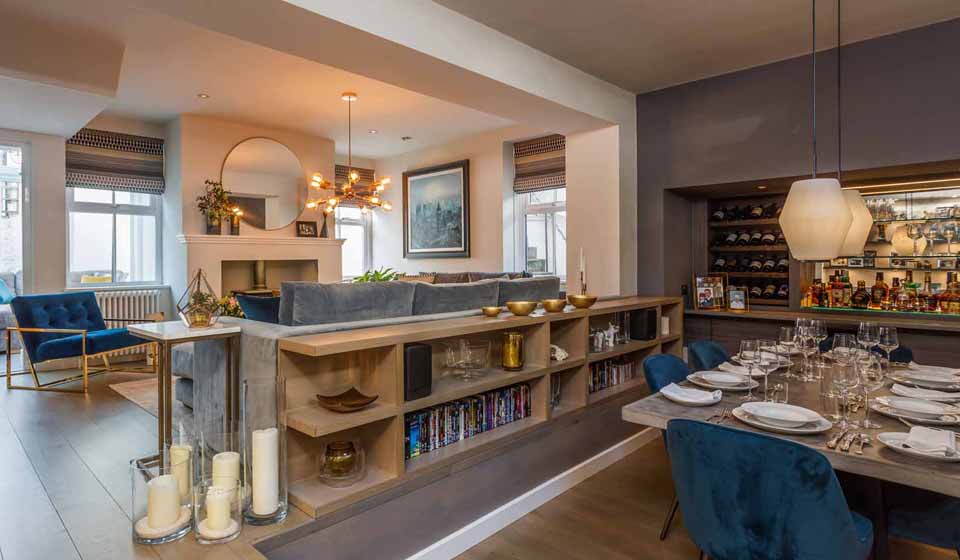
At this beautiful period property, situated on one of the most sought-after residential streets in Hove, our brief was to create a living room, open-plan kitchen & adjoining dining room that felt bright, contemporary and minimal, whilst remaining in keeping with the property’s age and existing features. Our designs allowed the kitchen and dining area to work together harmoniously, giving the property an integrated, fluid feel. Providing plenty of space for dining in the brightest part of the house, the layout and use of multifunctional furniture pieces means that our clients now have fully flexibility when it comes to dining as a family, and when the time comes to entertain guests.


A sense of lightness and space
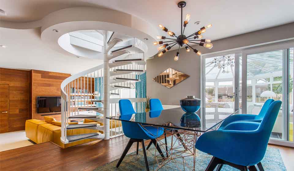
Our original brief was to create a concept for a proposed extension to the family’s existing home. However, shortly after presenting our ideas, the clients decided that in fact they no longer needed the extension, and that they could create the sense of space and flexibility they required simply by opening up their existing kitchen to the dining and living areas, and by introducing contemporary glazing to the original external walls. This allowed for an influx of light to the home, and a larger allocation of the budget to the interior design!
Our designs reflected a modern minimal scheme, with a noticeably nordic twist.
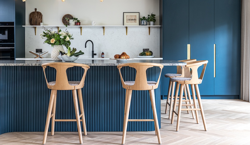
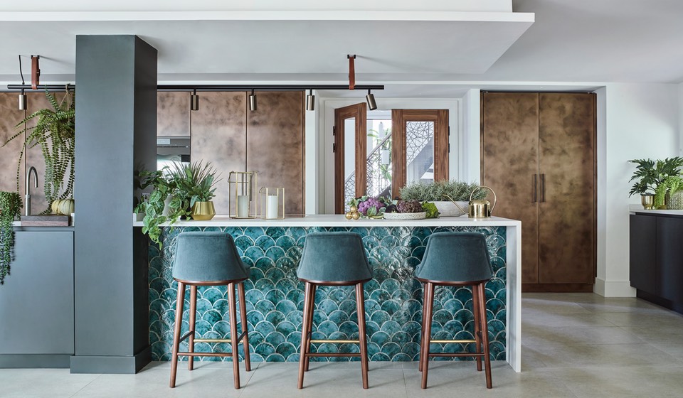
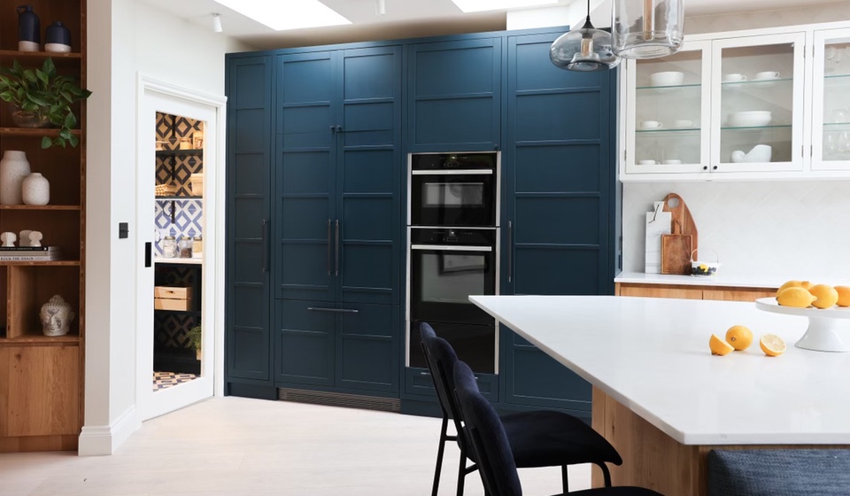
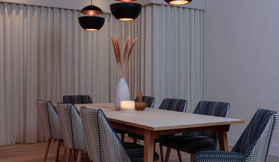
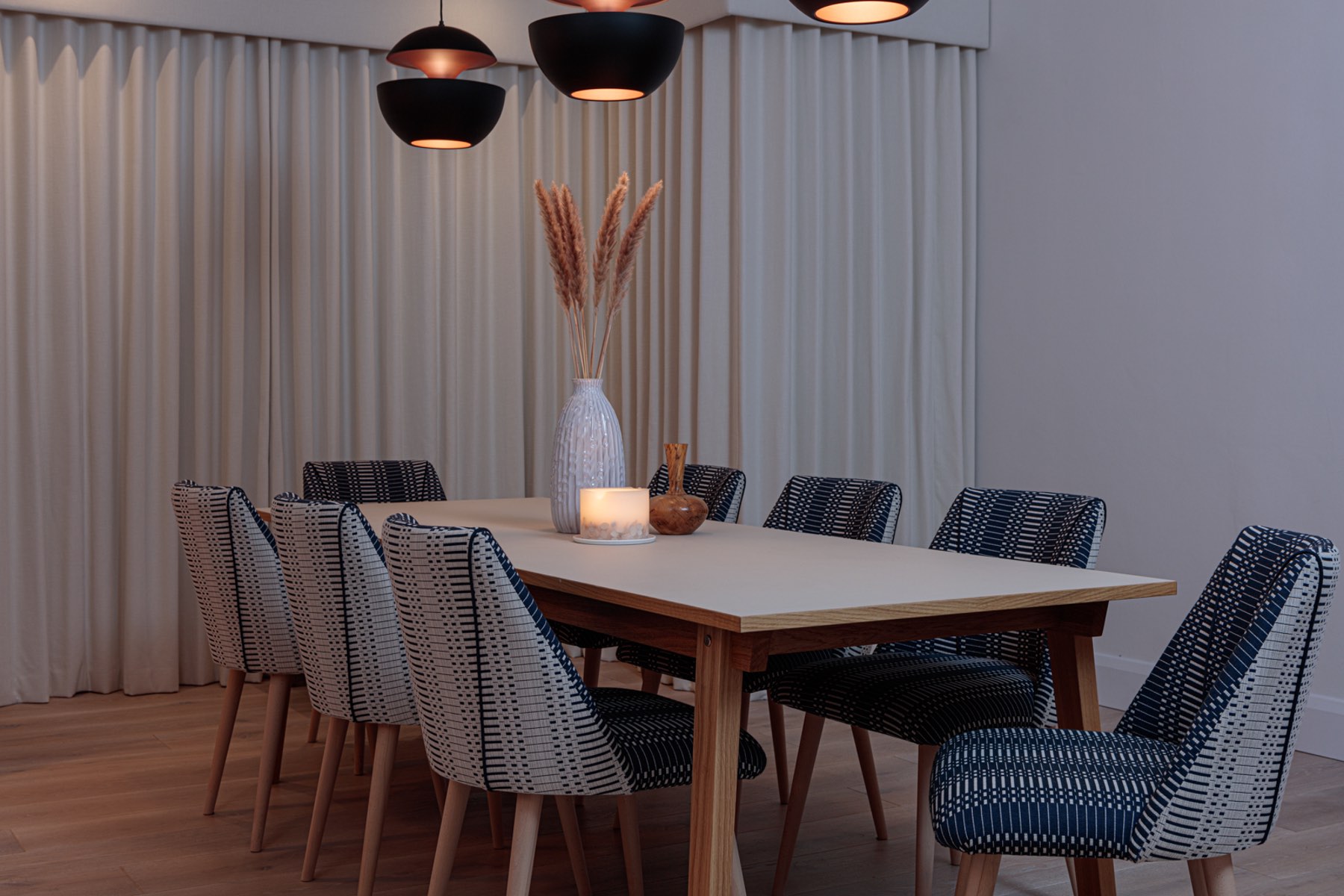
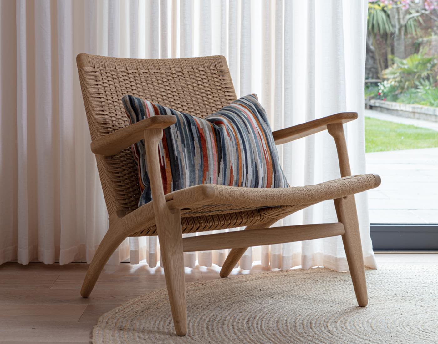
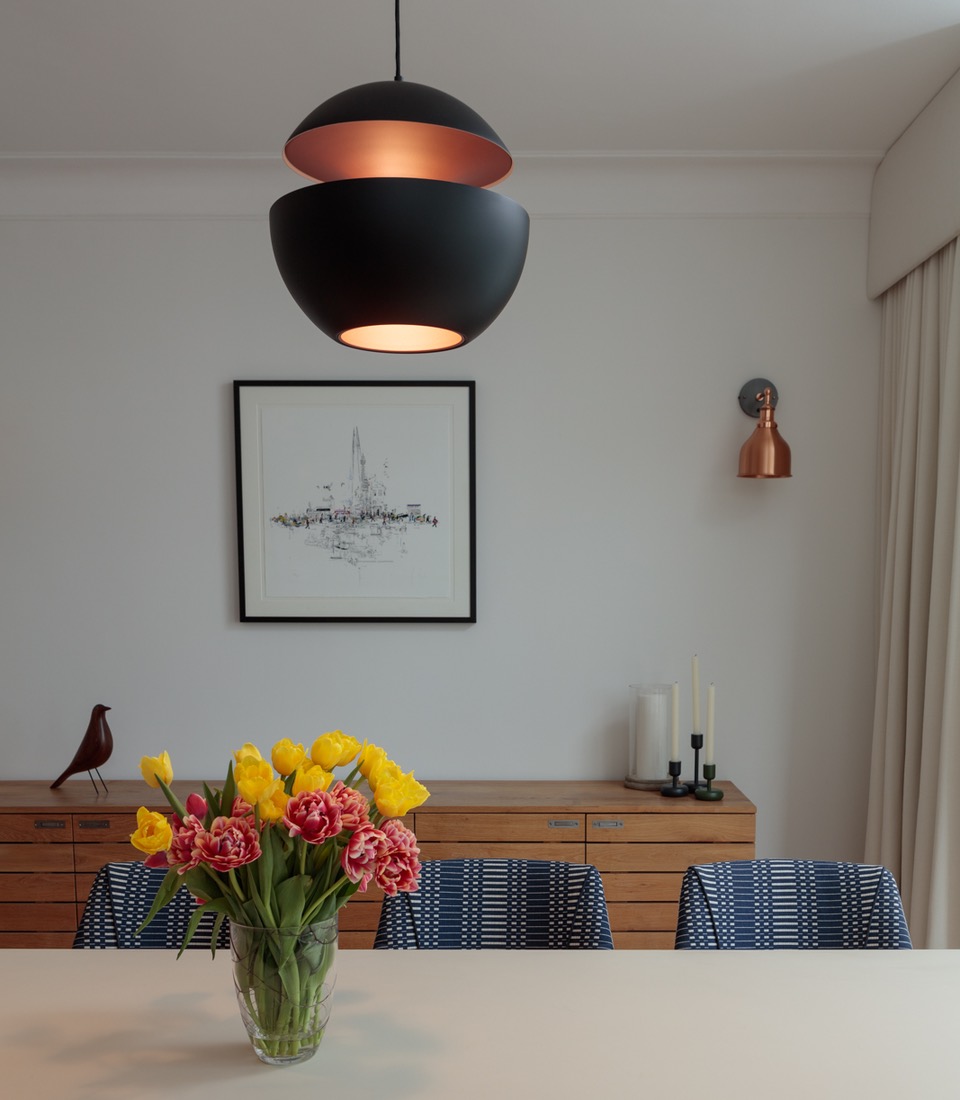
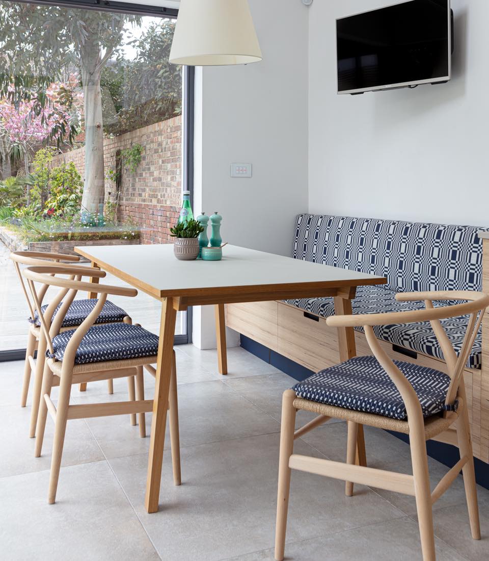
Keeping the kitchen pared back, and minimal, and incorporating an abundance of high-spec kitchen appliances and hidden storage space for a family who love to cook, helped create this clean, organised and totally zen cooking and dining space. The considered use of Scandinavian design icons, like the Carl Hansen Wishbone dining chairs, give a nod to our design’s nordic inspiration. Whilst contemporary geometric fabrics, in the form of bespoke upholstered seat pads using fabric by Finnish textile designer Johanna Gullichsen, ensure that the space is not short on personality and individuality.
Pale timber and organic elements were incorporated throughout to ground the scheme, whilst flexible decorative lighting proved imperative. The use of the cantilevered Tolomeo Mega wall light by Artemide ensured that the family would have dimmable task lighting over the dining table when required, and the flexibility to articulate the light source away when not in use, allowing for a more flexible take on a dining room pendant and the fact that the dining table can be moved when hosting larger parties.


A place for everything
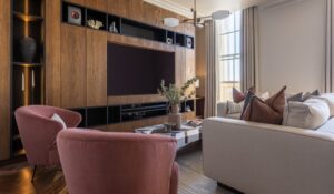
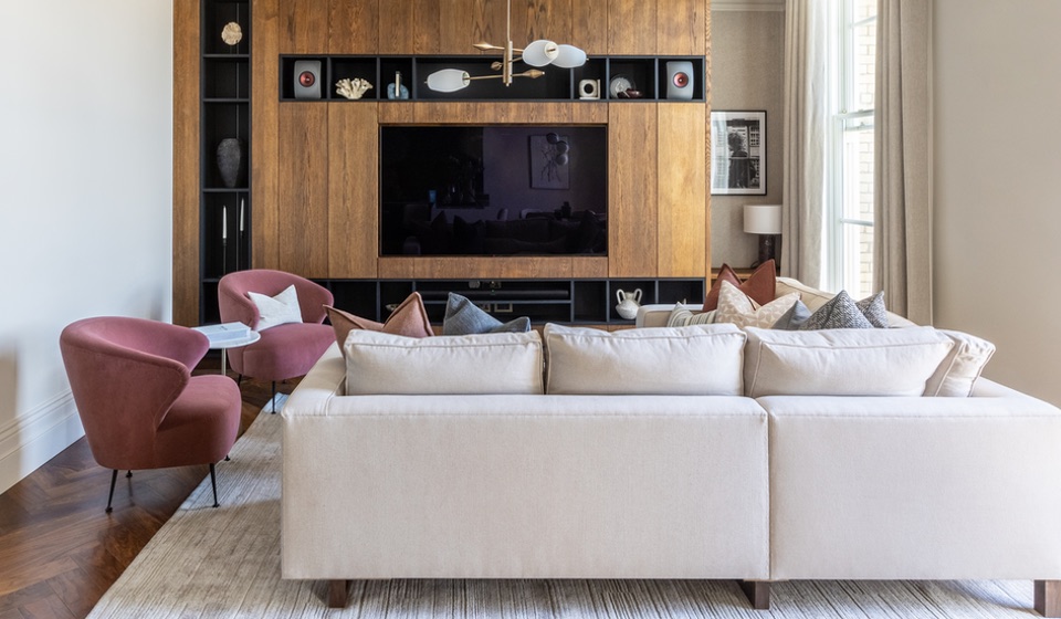
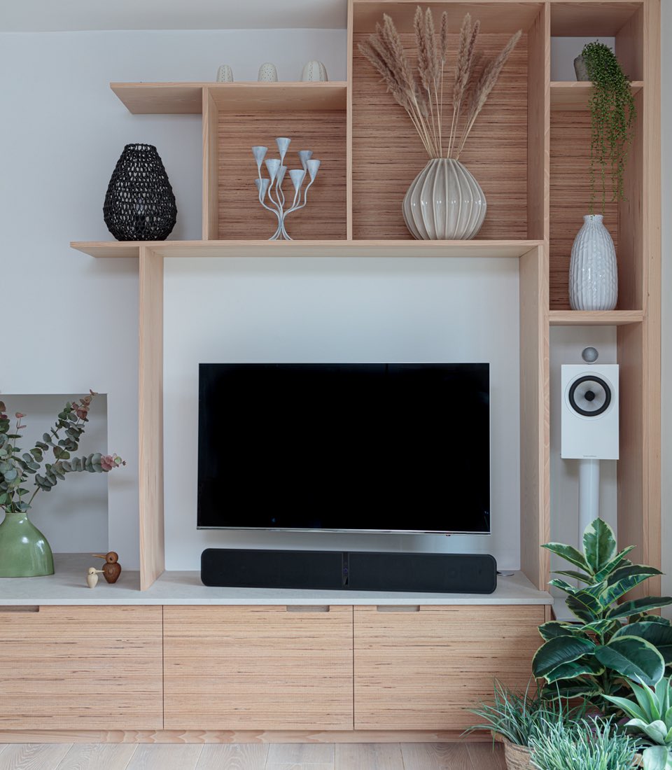
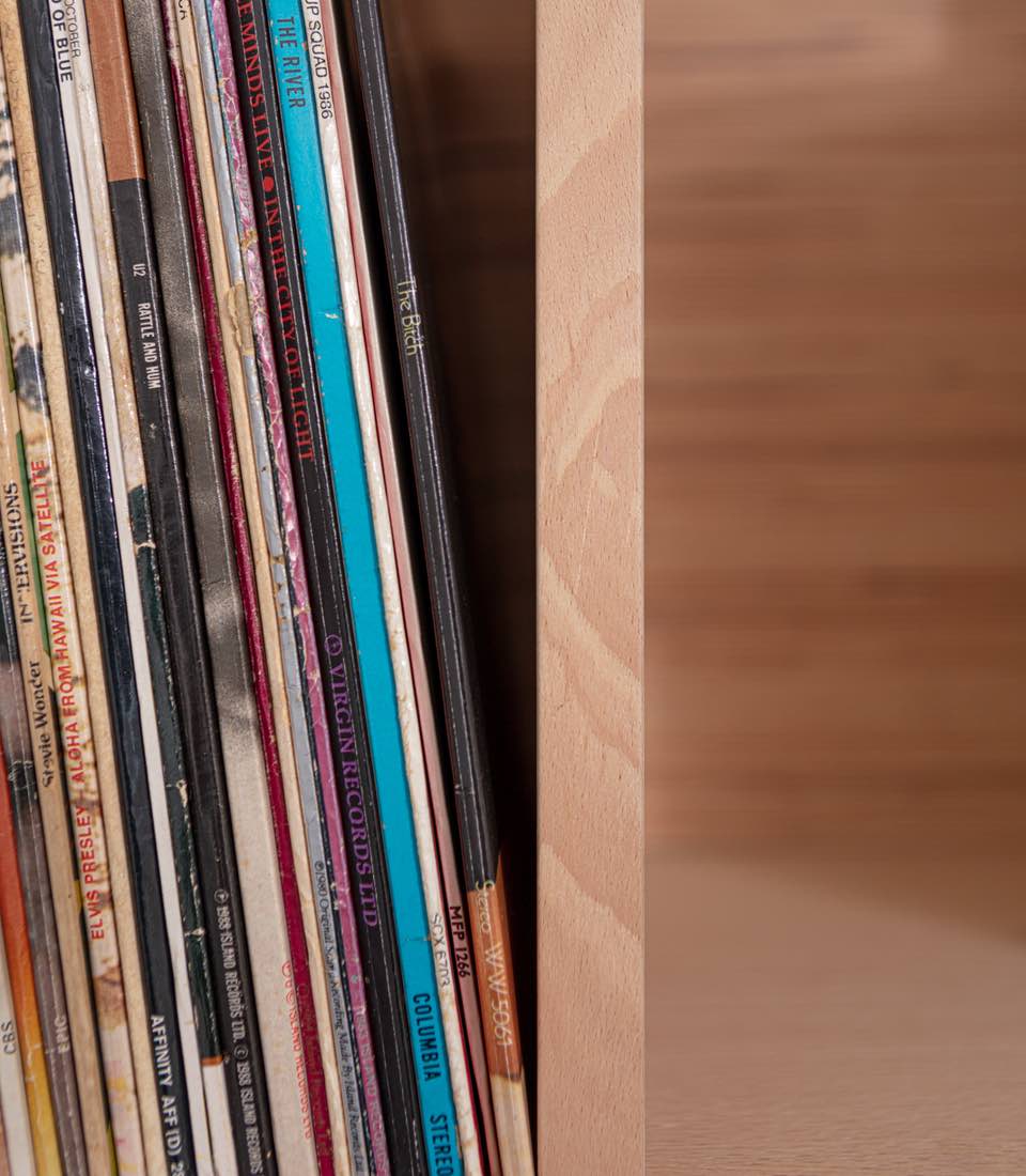
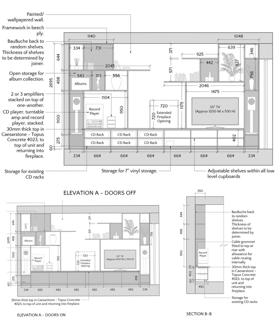
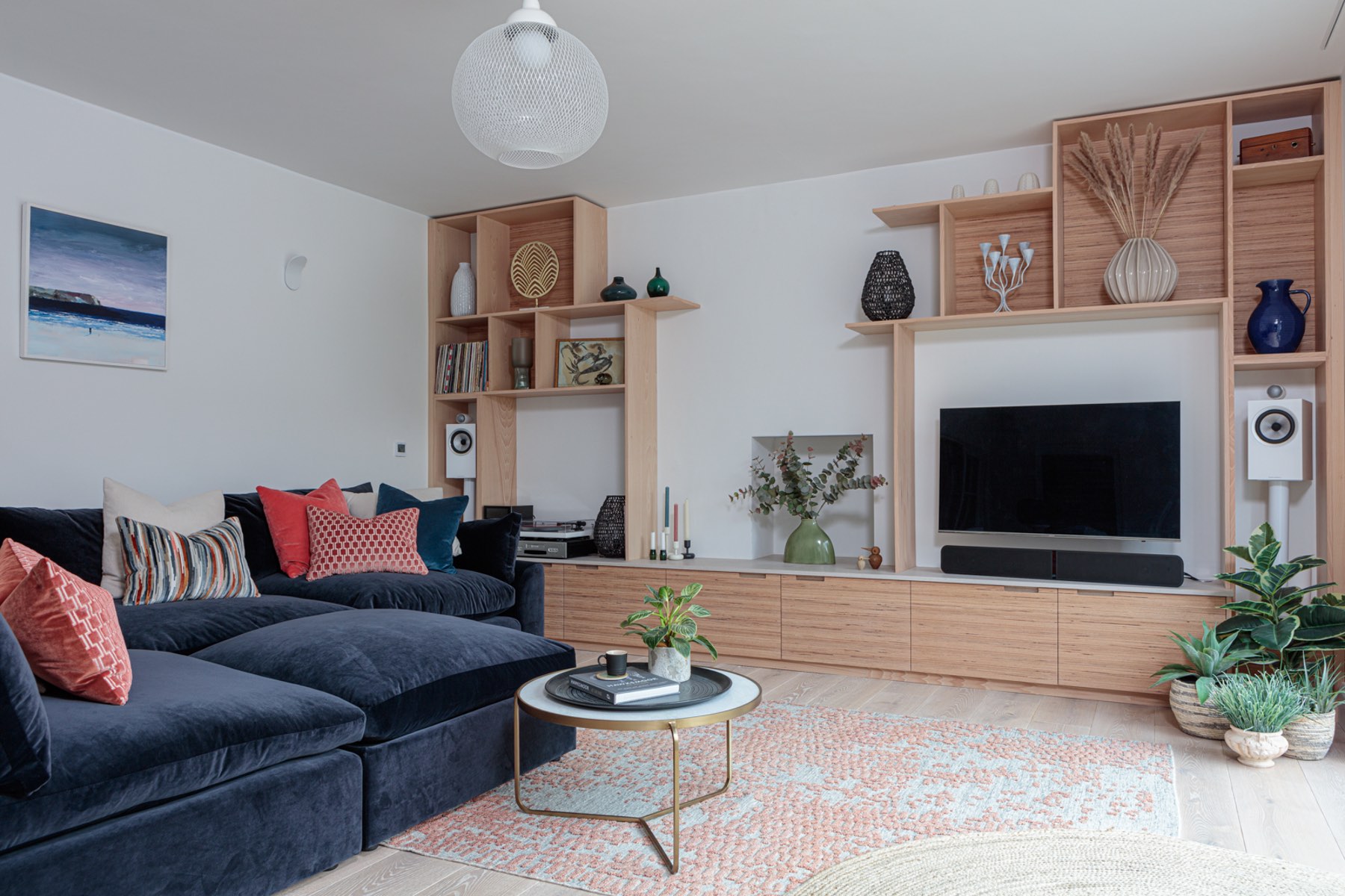
Being avid musos meant our clients have an impressive CD and record collection – not to mention turntables, record player and a host of Sonos speakers, amplifiers, subwoofers and other AV equipment to ensure the best possible sound throughout the house. Our joinery designs were client-led based on what they wanted to store within their bespoke media wall and ensured that every inch of storage was utilised.
Our joinery design incorporated CD racks, open storage for album display, cable grommets to ensure a clean, tidy feel, considered storage for amplifiers as well as cleverly disguised blanking panels to raise speakers to their optimum height for maximum sound impact.
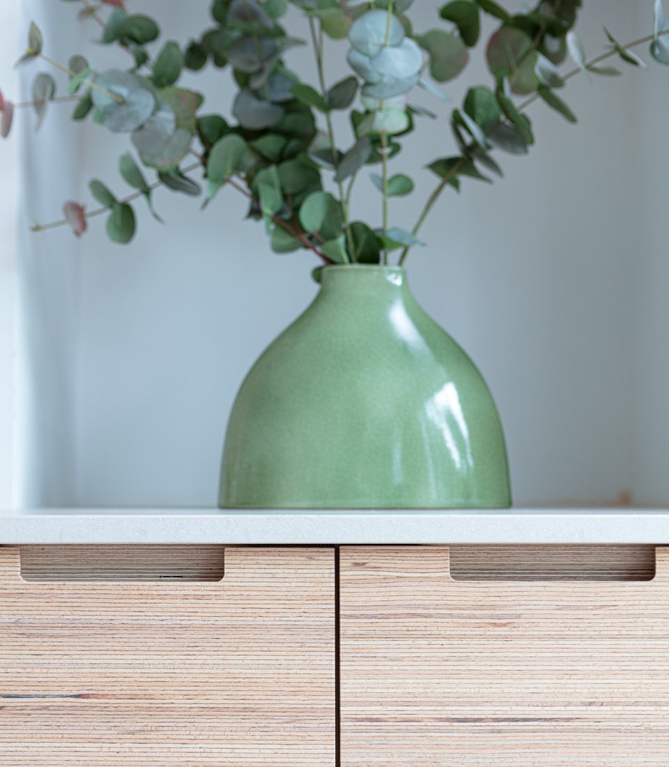
In terms of finishes, this bespoke media unit was designed to work within the wider Scandinavian-inspired scheme. Utilising contemporary materials mirroring those used in the kitchen, including birch ply frames, BauBucke cabinet doors and backs, and a Caesarstone worktop, kept the joinery wall from feeling too traditional and stuffy for this modern family.
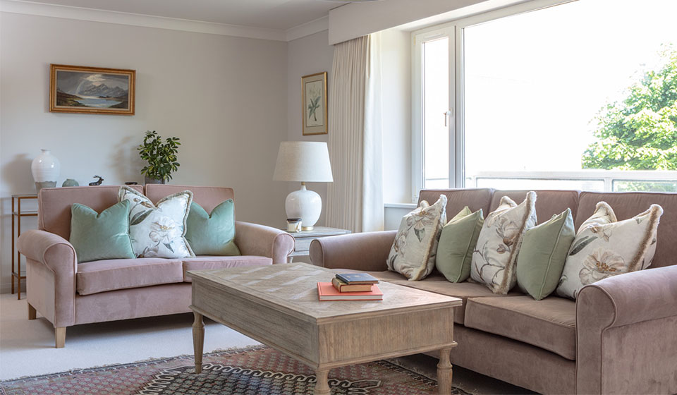
Leaving a selection of random shelving without a specific intended purpose meant that the family could personalise and style the shelves themselves, adding their own sense of style and personality – without feeling too contrived. An abundance of real and faux plants, artwork, dried flowers, vases and accessories help to soften and personalise the Living Room, and adding depth and warmth to the sleek, contemporary materials.
to arrange your local interior design discussion, or call us 01273 499 200
